Kinzi
Brand Design, UX Design, Desktop/Mobile Design
Kinzi is a company that designs and manufactures sports and fitness equipment, from resistance bands and jump ropes, to scales and water bottles. They had outgrown their tough, unapproachable, masculine logo and were hoping to evoke a more energized, friendly, and feminine feel.
Brand Strategy
Kinzi is proud of their well-researched products. They truly care about creating fitness items that are thoughtful and durable. With this in mind, I created a few inspiration boards to guide the logo and identity development.

The first leaned a bit on the technical and durable concept, but was a tad too masculine. The second was more minimal and upscale, but lacked energy and friendliness. The last was bold and activating, but maybe too whimsical. In the end, we agreed that a magical mashup of all three directions would be the best way to go. Technical, modern, and energetic.
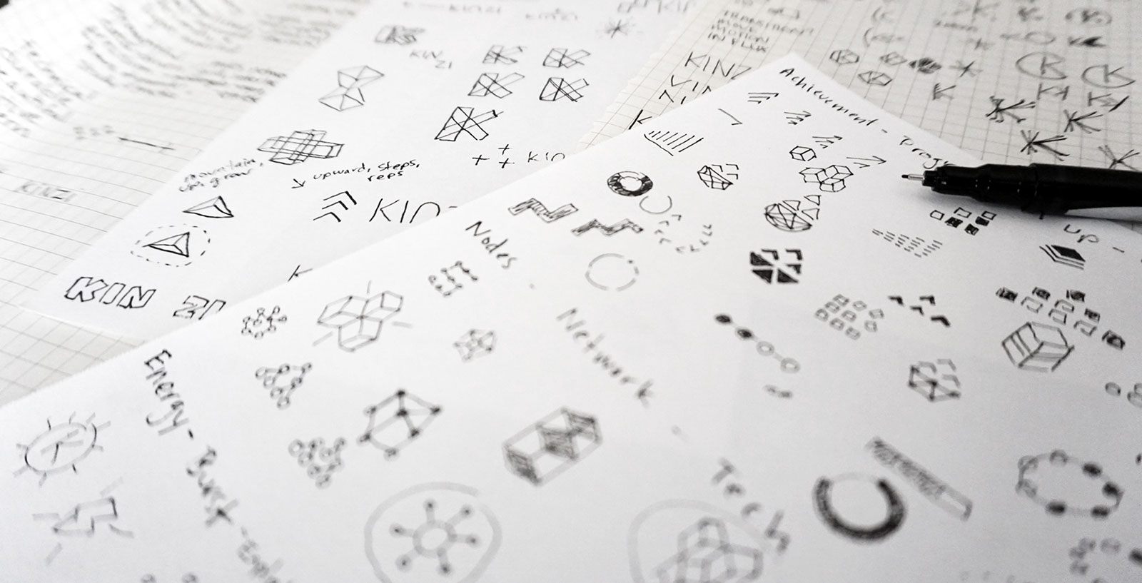
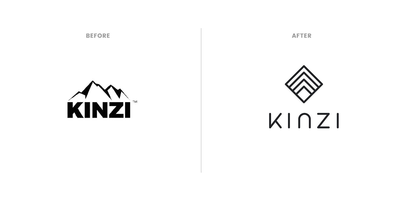

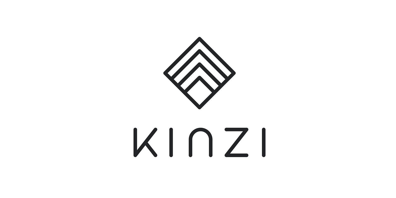
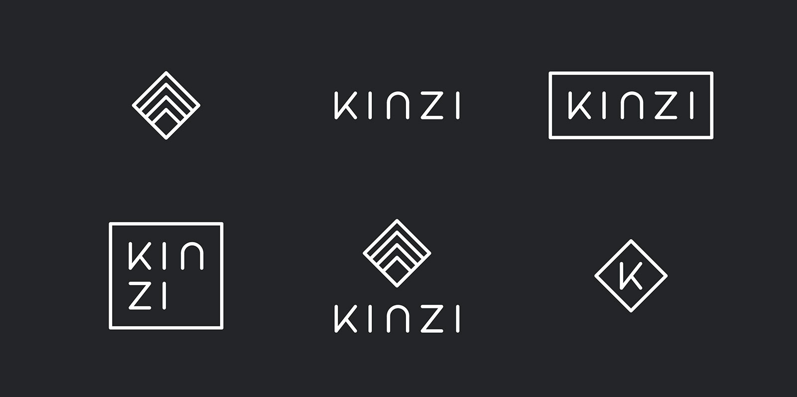
While developing the mark, I explored how to communicate the idea of growth and progress, climbing a mountain step by step, building blocks, and the upward concept of achievement. In the end, we settled on a mark that embodied almost all of those ideas.
The letters of the custom Kinzi logotype are thinner to look less aggressive. The roundedness of the edges and the N give it a more friendly and approachable feel.
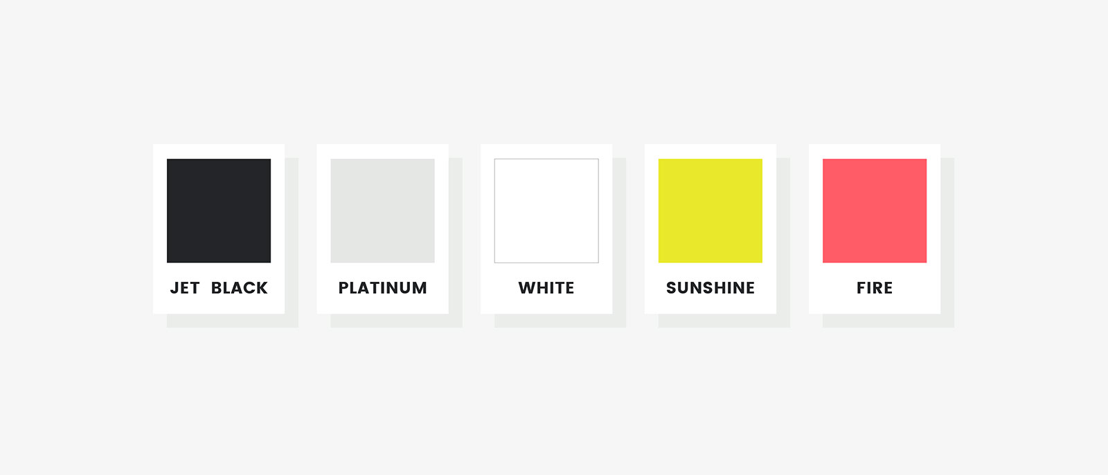
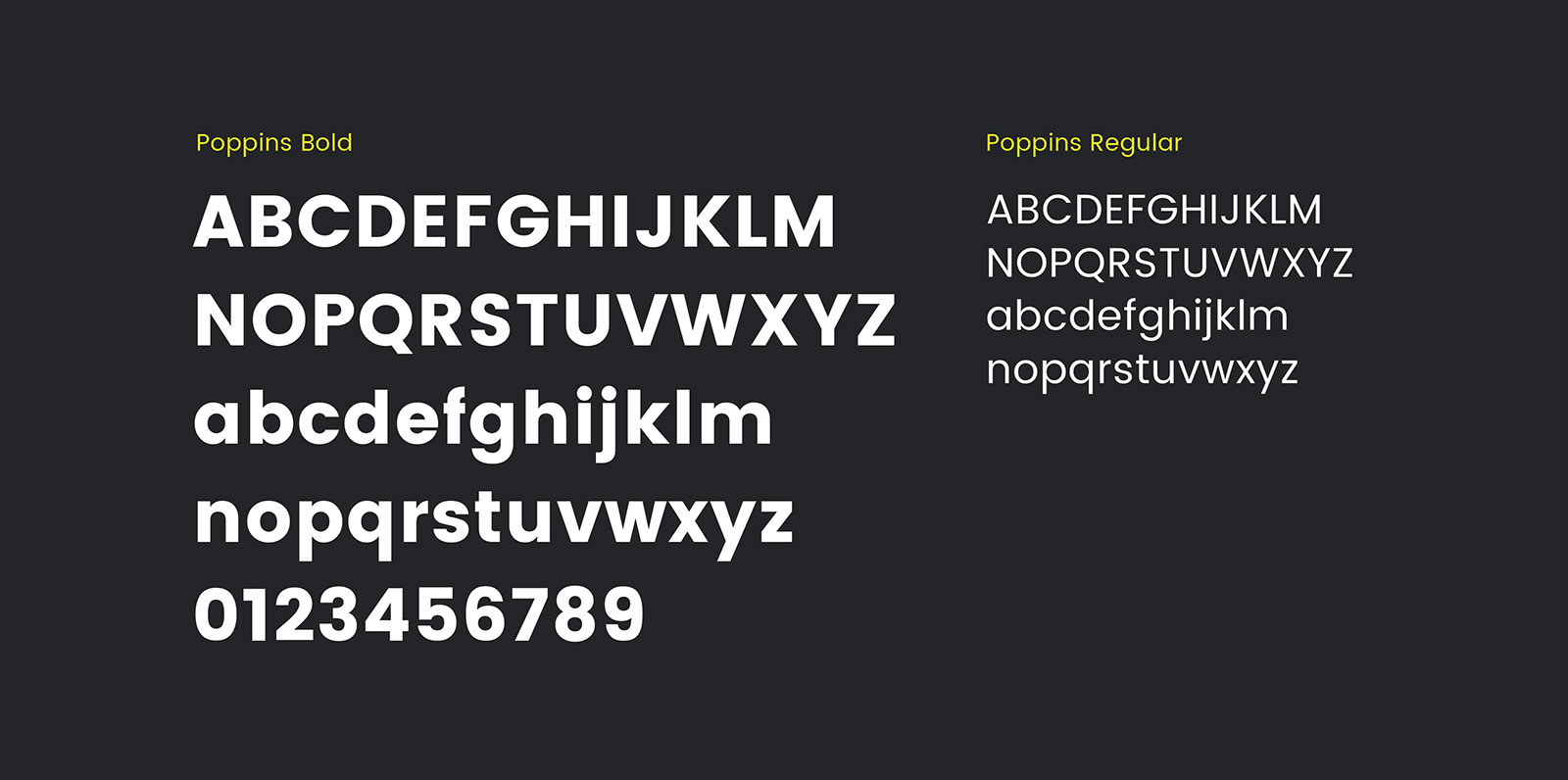
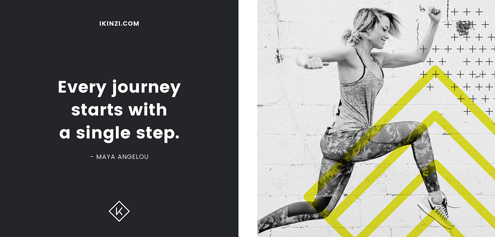
I chose colors and a typeface to expand on our brand direction. Pops of yellow are optimistic and energizing. Poppins is a modern typeface with a neutral, but friendly feel.
