TruePic
Brand Design, UX Design, Desktop/Mobile Design
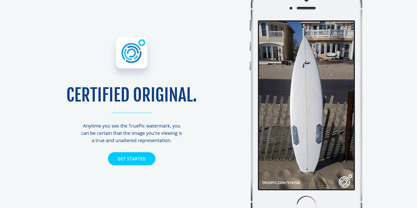
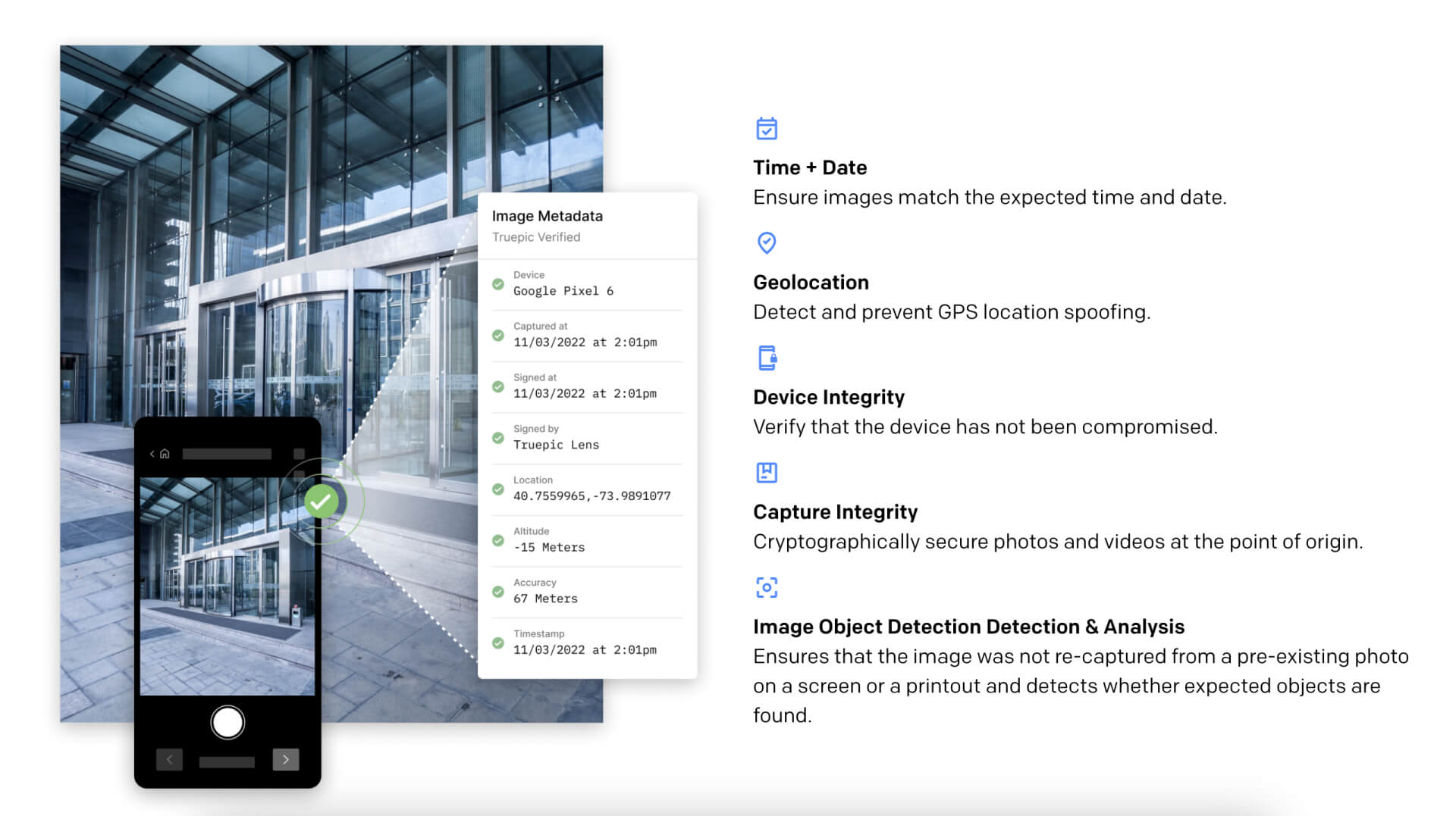
TruePic is a digital notary for images, certifying the authenticity of photos taken with their app in a world where it’s easy to deceive people or companies with digital photography manipulations. A huge range of industries can benefit from this technology—insurance, rental cars, and real estate are a few. TruePic’s app records the exact time and location a photo is taken, with the verifiable information available online.
The founders of TruePic wanted to level up their brand as they continue to pitch their technology to new companies.



I crafted a strategy with TruePic’s audience in mind—35-65 year-old executives with experience in enterprise software. The brand needed to feel trustworthy and modern, without being too techy or futuristic.
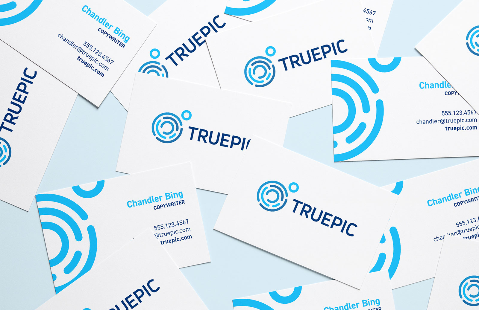
The logo mark is a combination of a camera lens and a fingerprint, blending the ideas of images and authenticity. Both elements of the logo—the mark and word—required clean lines and a sense of geometry in order to convey stability and strength.
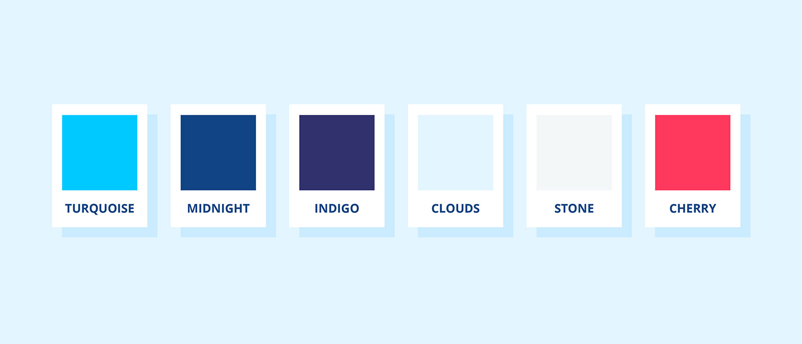
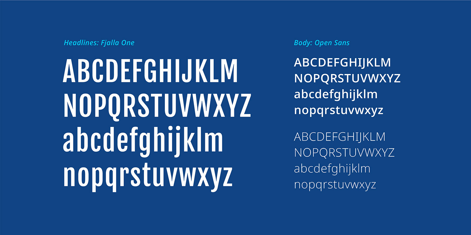
For the color palette, a conservative blue communicates trustworthiness most easily, but I gave it a little twist and focused on turquoise, navy, and indigo. Like the logo, the typography needed to convey the stability and reliability of TruePic’s promise, so both fonts are geometric and sturdy.

Truepic 2.0
After my branding work for Truepic, they went on to successfully complete multiple rounds of funding and grew their company to over 20 people. Recently, they contacted me to help them scale their website for a new launch. I was so happy to work with the founders again and see how successful they've been as a business. I helped them create pages to target specific niches in their industry.
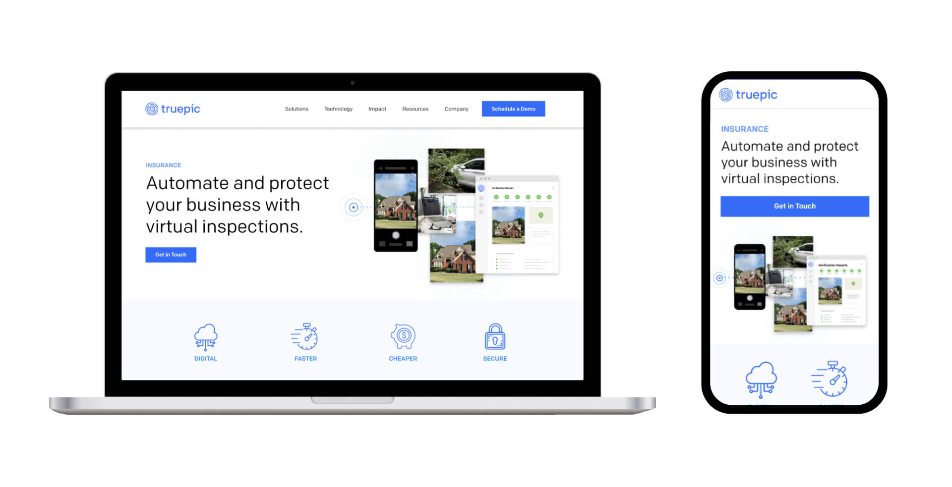
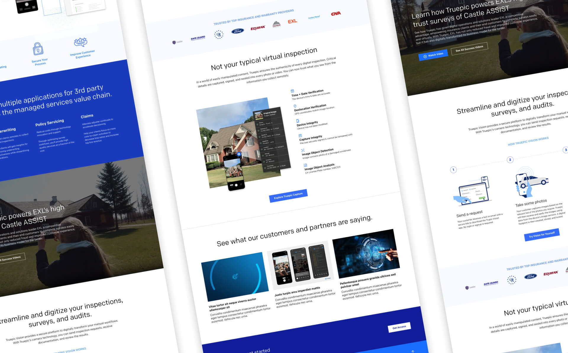

It was such an honor that they kept me in mind and brought me back to work with their now in-house designers on this project. I can't wait to see where they'll go from here.
